I was inspired by the art of Makoto Shinkai, an animator, filmmaker, and manga artist. I love his work - so beautiful! The illustrations and films are just at another level, and I would like to experiment with trying to bring my own work into that style.
This post will mostly be a step-by-step on how I attempted to integrate that style into my CocaCola Machine:

Firstly, in hindsight, this is actually a difficult scene to convert to Shinkai's style. My scene is very grungy, dank, and dark, while his works stay closer to picturesque and clean. No matter, this is all about experimenting right? Maybe in the future I can create a better scene to try this.
First, I took this render into photoshop as an EXR image. I like to render using the Movie Render Queue (I have a post on that) because there are more options for anti-aliasing and console variables.
In photoshop I brightened the image's exposure, just to brighten the dark areas. For this, I was okay with loosing some of the grunge and darkness for the sake of the style.
I then converted the image from an EXR (32 bit) to an 8bit image so that I could peruse the filter gallery. Initially, in the tutorials I found, they edited the color values and luminance to achieve a paniterly look. The grunge in my scene could not be smoothed out like that though, I would have to smooth it out manually or use a strong filter. After duplicating the image layer and hiding the original layer, I explored the FIlter Gallery.
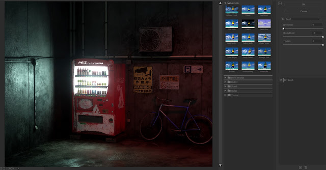
I used the Dry Brush filter (at above settings) but the image didn't completely smooth out. I did like the results, so I went through with the smudge tool and smoothed out areas like the signs, the ground, and the sides of the vending machine.

After locking that layer, I created a new one for 'patch smudging.' This is where I chose a section on the wall and with the color picker, I brushed on patched of color to smudge out. Iused Kyle's Paintbox - Wet Blender 50.


Since I was smudging the color around, it is not 100% opaqe, so some detail from the image is coming through. I went over the walls and ground like this, and created a separate layer for the bike shadows, because I wanted to keep the shape of that shadow withough loosing it into the wall.
 |
| Patched Walls and Ground |
After, since I now knew what brushed out looked like on a larger scale, I went into the smaller pieces - piped, bicycle, signs again - on the bottom filtered layer (not the OG layer, the one above it.)
The signature look for anime and manga is the black outlines, of course. In my references (Not all Shinkai's work) there are thin black line work around foreground elements (if not all elements) and almost no line work in the background plate.

I elected to outline all of the elements, because I don't think I'm al the level to be able to have a whole background plate that has elements that wont blend into each other. It was also a great guide more me to tell where everything is since my image is so dark.
 |
| Linework |
The linework is a bit messy and too much, but this was my first time working like this, so I didn't feel too bad about it. I should have used a smaller soft round brush to outline, rather than a harder edged brush.
In my final render, I did a mix of blur and sharpen to smooth out the linework, and I turned down the opacity to 40%, which helped the whole image.
Next I added soft highlights. This step helped give the image more life and shape. It really popped some elements that faded into the background in the original render.
 |
| Soft Highlights |
While in some of my research and references the soft highlights are more consistent, I still wanted to keep the feel of grunge. Smooth highlights would have conveyed a clean smooth surface, which describes nothing in my scene. Just a Solid Color layer (white) with overlay enabled allowed for these highlights.
Lastly, I put in harder edge highlights. In the reference of the dining table, there are softer highlights on everything and harder, smaller spots of highlights are on the objects directly in the light. With another white Solid Color layer with overlay, I put in smaller spots of edge highlights on objects that could convey those types of reflections.
 |
| Harder Edge Highlighs |
I feel like this step, if done correctly, really helps put the image from painterly to painterly anime. It's not quite there, I might need to work on it more and get more practice.
Above is my final image (for now). I had a lot of fun doing this project because I rarely use post processing or photoshop on my renders after they come out of Unreal Engine. I think I might try this technique on some of my other projects, or maybe create projects with this technique and SKinkai's art style in mind.
Some links to tutorials I looked at for this project - I used then kinda, but they were good starting points:
By the way, I was whining to Kayleigh Sims about my woes with working with photoshop post-process (Me - a proclaimed 'can't draw' 3D artist and Kei - illustrator extraordinaire) and she just patted me on the shoulder and said it was a Skill Issue. ಠ_ಠ Like. I know, but she didn't have to say it like that!
No comments:
Post a Comment